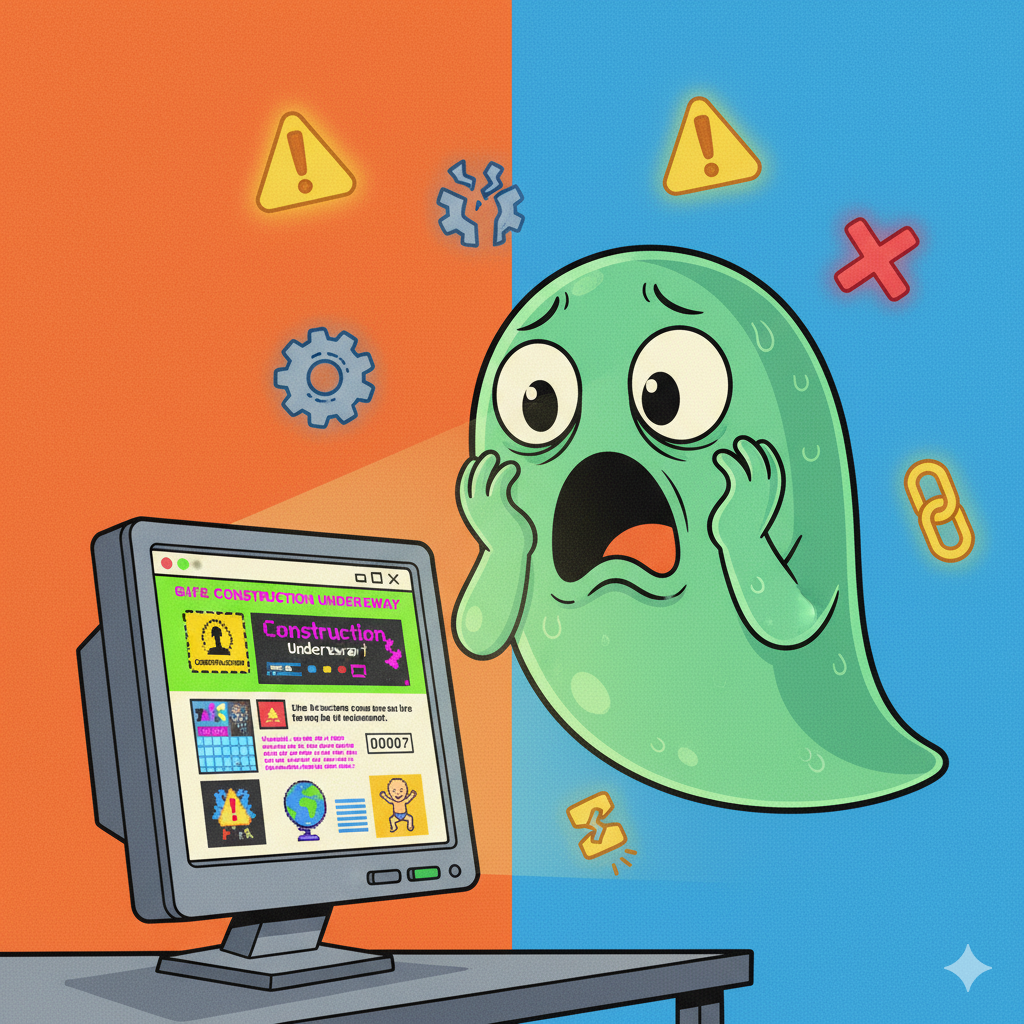
Your website is your most important digital asset. It’s your 24/7 salesperson, your brand ambassador, and your online storefront all in one. But what if, instead of welcoming customers, your website is actively turning them away? A bad user experience can be just as damaging as a rude employee.
Many businesses invest in a website but don’t see the leads or sales they expect. Often, the culprit is a design that creates friction and frustration. Here are five common ways your website design might be scaring away potential clients.
1. It Doesn’t Work on Their Phone
The Problem: This is the number one offender. A user visits your site on their mobile phone and is forced to “pinch and zoom” just to read your text. The buttons are tiny and impossible to tap, and the layout is broken. This is known as a non-responsive design.
The Result: They will leave in under 5 seconds and go straight to a competitor whose site does work. With over half of all web traffic coming from mobile devices, you are effectively closing your door to 50% of your customers.
2. It’s Painfully Slow
The Problem: Your page takes more than three seconds to load. This is often caused by massive, un-optimised images, bloated code from too many plugins, or a cheap, low-quality hosting plan.
The Result: Modern users are impatient. A slow site feels unprofessional and untrustworthy. Visitors will abandon a page that doesn’t load almost instantly, and Google will rank it lower in search results, meaning fewer people find it in the first place.
3. It’s Confusing to Navigate
The Problem: A user lands on your homepage and has no idea where to go. The navigation menu is a mess of 20 different links, the “Contact” button is hidden, and they can’t find a simple list of your services.
The Result: A confused mind always says no. If a user can’t find what they’re looking for in a few clicks, they won’t try to “figure out” your site; they’ll just leave and find one that’s easier to use. Clear, simple navigation is essential for guiding users to a sale.
4. The Design Looks Outdated
The Problem: Your website looks like it was built in 2005. It has tiny text, clashing colours, pixelated images, or an old-fashioned, narrow layout.
The Result: This instantly destroys trust. A dated design signals that your business may also be dated, unprofessional, or even defunct. It creates an immediate sense of distrust and makes a visitor second-guess your credibility before they’ve even read a word.
5. There is No Clear Call-to-Action (CTA)
The Problem: A user reads your service page… and then what? There’s no clear button or instruction. You’ve provided information but haven’t told them what to do next.
The Result: The user simply drifts away. Your website must be a tool that guides visitors. Every page should have a clear, obvious “next step” – whether it’s “Book a Free Consultation,” “Get a Quote,” or “View Our Portfolio.” A strong call-to-action turns a passive visitor into an active lead.
Your Website Should Be Your Best Employee
Your website should be working for you 24/7, attracting new leads and building trust in your brand. If it’s failing at any of the points above, it might be time for a professional redesign.